
Have you ever noticed how some apps feel intuitive the moment you open them? Or how your eye glides through a webpage without consciously thinking about where to look or click?
Chances are, the designer understood something about how the brain interprets visual patterns, whether or not they realized they were drawing on Gestalt psychology.
Throughout my career as a product designer, including at Airbnb and Colgate, I’ve used Gestalt psychology to structure complex dashboards and user interfaces. I draw on principles like proximity and similarity to make information-heavy products intuitive and easy to navigate. In this article, we’ll examine these Gestalt principles and how they help UI and UX designers create clear and engaging experiences.
What Is Gestalt Psychology?
Gestalt, a German word meaning “pattern” or “form,” refers to a set of psychological principles that describe how the human brain instinctively arranges what it sees into coherent forms.
Gestalt theory helps explain why we:
- Notice faces in clouds and rock formations.
- Spot animals and familiar objects in fabric and wood grain.
- Perceive a flock of birds as a single shape streaking across the sky.
These automatic visual interpretations can be described collectively as the Gestalt effect, and are often associated with the idea that “the whole is other than the sum of its parts.” In other words, our perception of a scene is shaped by how elements are interpreted as a group, rather than by individual components seen in isolation.
Why Gestalt Still Matters in UX Design
Gestalt grouping principles are a foundational concept in user experience (UX) and user interface (UI) design. This is because the same perceptual habits that shape how we process the world around us also explain why users respond to structure and order.
Most users don’t consciously analyze spacing, alignment, or contrast; they simply follow what feels coherent. Designers who understand this can build interfaces that feel intuitive from first glance because they mirror how the brain naturally processes visual information. When used effectively, Gestalt principles can significantly improve aesthetics, functionality, clarity, and user-friendliness.
This article covers 12 key Gestalt principles of perception, from similarity and proximity to figure/ground and symmetry, and explores why they remain central to modern UX and UI design.
Origins of Gestalt Psychology
Gestalt psychology was pioneered in the early 1900s by German psychologists Max Wertheimer, Kurt Koffka, and Wolfgang Köhler. The trio’s work was a reaction to theories of perception that viewed experience as merely a collection of sensory inputs, instead of a complex process shaped by the mind.
At the time, most psychological research focused on measuring how people responded to different sensations, including:
- Sounds
- Lights
- Colors
- Textures
This often involved exposing study participants to stimuli and recording how quickly or intensely they reacted.
While this kind of early experimental psychology helped researchers understand how the senses work in isolation, it overlooked the broader question of how the brain translates sensory inputs into more holistic experiences.
How the Brain Shapes Our Perception
Wertheimer, Koffka, and Köhler argued that the brain naturally organizes sensory information into visual forms that feel coherent or familiar. With this in mind, they set out to demonstrate that they way our minds process information shapes what we see in the first place.
In one of Wertheimer’s early experiments, participants were shown two lights flashing in quick succession. Even though the lights were fixed in place, observers consistently reported seeing a single light moving back and forth.
This illusion, later named the phi phenomenon, showed that motion isn’t just detected by the eyes, but constructed by the brain. When two lights flash a fraction of a second apart, the brain treats them as part of a single ongoing event. It does this to maintain visual continuity, creating the impression of movement where none exists.
How Gestalt Theory Shaped UI and UX
Today, the phi phenomenon is considered a cornerstone of Gestalt theory, and Gestalt’s core idea, that people seek order and relationship before detail, remains the foundation of human-centered design.
The work of Wertheimer and his colleagues laid the groundwork for everything from modern interface design to data visualization. In UX, the same principles govern how users make sense of visual systems: how they group related information, recognize hierarchy, and follow patterns that feel consistent and logical.
What Are the Gestalt Principles?
The table below summarizes 12 core Gestalt principles of design, each with a brief definition that captures its central idea.
|
Principle |
Definition |
|
1. Similarity |
Visual elements that look alike are perceived as being related. |
|
2. Proximity |
Objects positioned close together are perceived as being related. |
|
3. Continuity |
The eye tends to follow smooth, continuous lines or paths. |
|
4. Closure |
The brain instinctively completes incomplete forms to create something visually coherent. |
|
5. Figure/Ground |
The brain separates a focal object (figure) from its background (ground). |
|
6. Symmetry and Order (Prägnanz) |
The brain perceives ambiguous or complex forms in their simplest, most familiar interpretation. |
|
7. Common Fate |
Objects that move in the same direction are perceived as a group. |
|
8. Common Region |
Elements within the same bounded area are seen as related. |
|
9. Uniform Connectedness |
Visually connected elements are seen as related. |
|
10. Emergence |
The brain perceives a whole before identifying its parts. |
|
11. Invariance |
The brain recognizes a familiar object even when its appearance has been altered. |
|
12. Multistability |
When an image is ambiguous, the viewer’s perception can switch between multiple interpretations. |
The Gestalt Principles of Design
Let’s take a closer look at the 12 core Gestalt principles, examples from UX and UI design, and the psychology that explains how they work.
1. Similarity
It’s human nature to group similar-looking things together. In Gestalt psychology, this explains why we perceive separate objects as belonging to the same group when they share visual features like shape, size, or color.
Definition: Visual elements that look alike are perceived as being related.
Psychological basis: The brain looks for patterns that reduce cognitive effort. Recognizing shared traits helps us process complex visual information quickly.
Classic example: A classic Gestalt grouping principle is demonstrated in the image below. Even though the chess pieces are all different, we automatically group them together because their base shape and overall proportions are similar.
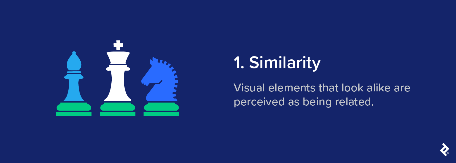
UX/UI application: UI and UX designers use similarity to establish relationships between elements and guide user attention. For example, a features list that uses repetitive design elements, such as an icon paired with a few lines of text, creates visual similarity that helps users scan and interpret the content more easily.
Even something as simple as formatting links consistently hinges on the law of similarity, influencing how users perceive the structure and organization of your site.
Modern brand example: Spotify applies the Gestalt principle of similarity through consistent iconography and typography, creating a cohesive experience across its mobile and web apps.
Design takeaway: Consistency helps reinforce relationships and establish visual hierarchy. Conversely, you can make elements dissimilar if you want them to stand out in the visual hierarchy. This is why links, buttons, and call-to-action elements are often designed in a different color or style to the rest of a webpage: it helps capture the visitor’s attention and draws them toward the desired action.
Common mistake: Overusing similar styles across elements can weaken visual hierarchy and make it harder for users to tell what’s interactive or important.
2. Proximity
People tend to assume that things positioned close together belong together, even if they don’t share other visual characteristics. Proximity is one of the clearest visual grouping cues.
Definition: Objects positioned close together are perceived as being related.
Psychological basis: The brain treats proximity as an indicator of shared meaning. When elements sit near each other, we interpret this closeness as a sign of relationship or shared purpose.
Classic example: In the image below, spacing is the only difference between the dot columns in the center and those on the edges. Despite this, our brain automatically interprets the three columns in the middle as a separate group.
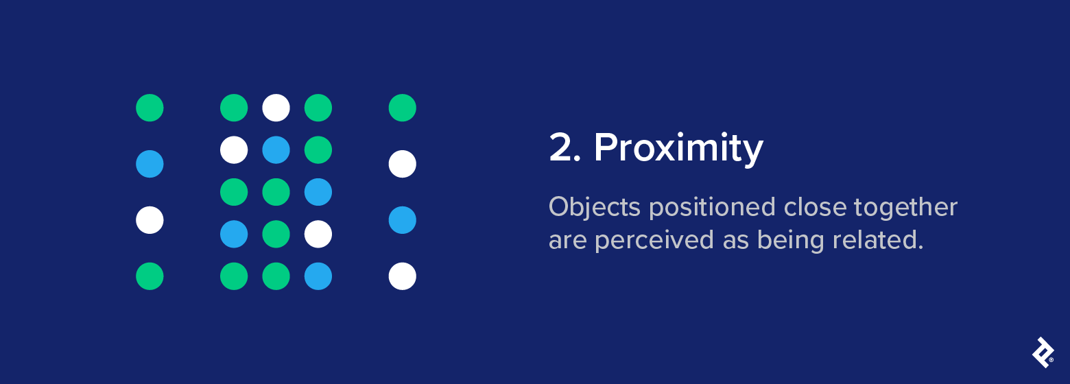
UX/UI application: The Gestalt law of proximity influences how people navigate visual layouts. In UX design, Gestalt proximity is often used to structure information without having to rely on lines or boxes. Related items, such as a form label and its corresponding input field, are instead positioned close together to make the connection clear.
Modern brand example: A good example can be found in the layout of Google Workspace apps, which use spacing to group related icons and tools, like text formatting options in Google Docs or action buttons in Gmail, without relying on lines or borders.
Design takeaway: Proximity helps users quickly understand your layout and guides them through it without explicit instructions. Separation is equally important: Adding space between unrelated items reduces visual clutter and makes structure clear.
Common mistake: Inconsistent spacing blurs relationships and leaves users unsure of what belongs with what.
3. Continuity
The Gestalt principle of continuity posits that the human eye naturally follows the easiest visual path when scanning a layout or scene.
Definition: The eye tends to follow smooth, continuous lines or paths.
Psychological basis: Our brains like to follow the path of least resistance, preferring a continuous flow of motion over abrupt changes in direction.
Classic example: In the figure below, the eye sees the separate green dots as a continuous arc that moves from left to right. The uniform color and spacing of these dots make them less cognitively taxing for the brain to interpret.
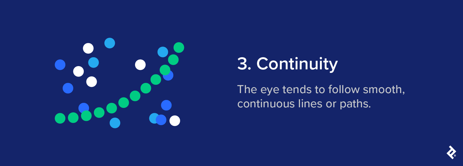
UX/UI application: Continuity is a valuable tool when the goal is to guide the visitor’s eye in a certain direction. Their gaze will follow the simplest path on the page, so it’s important to make sure any key elements you want them to see fall within that path. Since the eye is drawn to continuation, arranging elements in a line will naturally guide focus from one item to the next.
Modern brand example: E-commerce sites like Amazon apply continuity in product carousels to encourage exploration and guide visitors to related items. The same principle underpins progress bars and scrolling transitions: Instagram’s Story interface and LinkedIn’s step-by-step signup flow both rely on this sense of continuous movement to keep users engaged and oriented.
Design takeaway: When applied intentionally, continuity directs attention and helps sustain visual flow.
Common mistake: Disrupting the natural visual path through uneven spacing, misalignment, or abrupt breaks interrupts comprehension, making the UX feel disjointed.
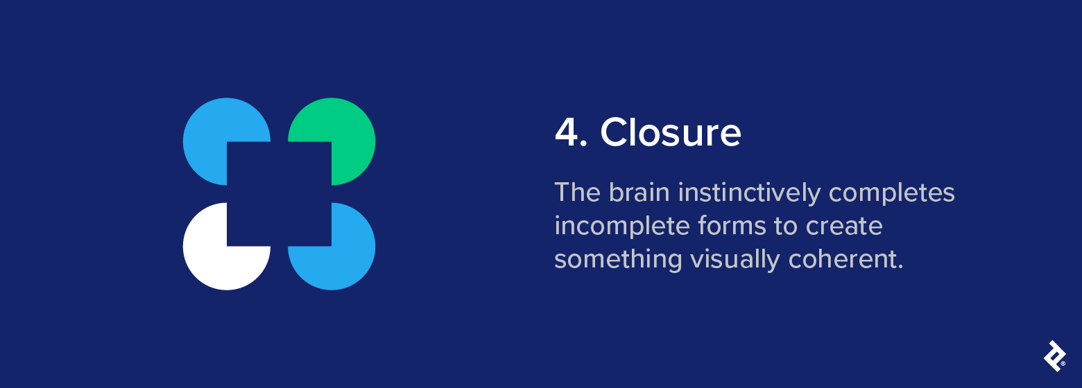
4. Closure
Closure is arguably one of the coolest Gestalt principles of perception. It refers to the idea that our brains perceive a whole image even when parts of it are missing.
Definition: The brain instinctively completes incomplete forms to create something visually coherent.
Psychological basis: The human mind craves consistency. When visual information is missing, the brain fills in the gaps to create a coherent and recognizable whole.
Classic example: In its simplest form, closure explains why your eye sees a square in the gaps created by the 3/4 circles. Our brains fill in the missing information to maintain a sense of completeness.
UX/UI application: A common example of closure in UX and UI design is the use of partial images that fade off the edge of the screen. Because the image feels incomplete, our brain seeks to complete it, prompting us to scroll beyond the frame. A full image doesn’t have the same effect, since we perceive it as whole and assume there’s nothing more to see.
Modern brand example: The World Wildlife Fund (WWF) logo clearly demonstrates the closure principle. Large chunks of the panda are missing, but your brain has no problem filling in the gaps. The NBC peacock, PBS’s silhouetted faces, and Adobe Creative Cloud’s overlapping “C”s use the same principle to make their logos memorable.

Design takeaway: Closure is most effective when the viewer can easily complete what’s missing. This depends on a balance between suggestion and recognition: Give just enough information for the mind to fill in the blanks.
Common mistake: If you make visuals too abstract, users won’t be able to tell what they’re meant to be looking at.
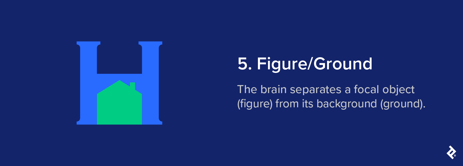
5. Figure/Ground
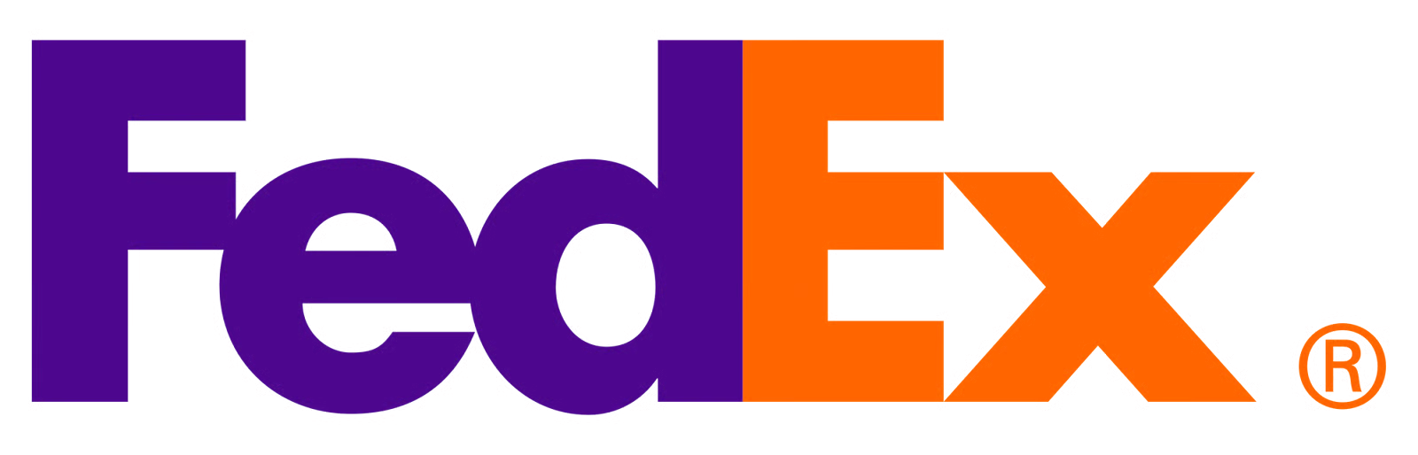
The figure/ground Gestalt law explains how we distinguish a focal object from the rest of a scene. It’s a familiar concept in visual perception and appears frequently in design and branding; think of the hidden arrow in the FedEx logo.
Definition: The brain separates a focal object (figure) from its background (ground).
Psychological basis: Our brains are wired to find focus in complex visual scenes and automatically distinguish between an object and its surrounding area. This helps us decide what to pay attention to and what to ignore.
Classic example: In the image below, the light green hue of the house causes the mind to bring it to the foreground, even though it exists on the same 2D plane as the “H” that appears behind it.
UX/UI application: The figure/ground principle can be handy when product designers want to highlight a focal point, particularly when it’s active or in use. Focus states, overlays, and hover effects depend on clear visual separation to help users distinguish between active elements and the background.
Modern brand example: Apple macOS uses high-contrast modal windows that stand out clearly against a dimmed background, making the active area immediately obvious.
Design takeaway: Designers can guide attention more effectively by controlling contrast and being thoughtful about how figure and ground are perceived. Our brains typically interpret the larger area of an image as the ground and the smaller as the figure. However, lighter and darker colors can also influence this, making contrast one of the most effective design levers for establishing visual hierarchy.
Common mistake: Visual separation breaks down when contrast is too low or the background is cluttered. This can make the interface feel flat and harder to navigate, leaving users unsure where to look.
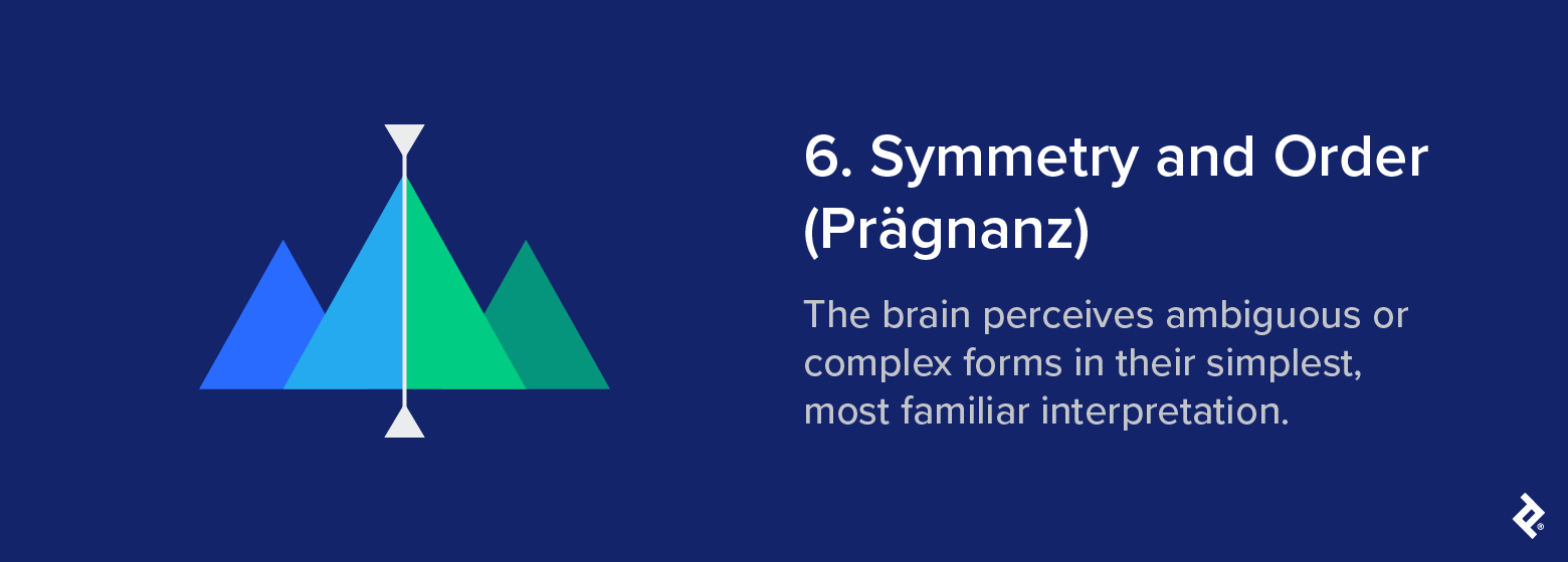
6. Symmetry and Order (Prägnanz)
Also known as “the law of good figure,” Prägnanz, the German word for “conciseness” or “precision,” describes how the human mind naturally prefers simple, coherent shapes to irregular or chaotic ones.
Definition: The brain perceives ambiguous or complex forms in their simplest, most familiar interpretation.
Psychological basis: We instinctively seek order in what we see. When faced with complexity, our brain simplifies visual information into something more immediately recognizable.
Classic example: The image below consists entirely of geometric shapes, but your brain instinctively classifies them as mountains or hills. This familiar interpretation is easier to see than a random assortment of triangles.
UX/UI application: Our preference for order makes Prägnanz especially useful when creating layouts. Interfaces that follow a clear underlying geometry tend to feel more coherent and less mentally taxing to scan. Even when the content changes, a strong spatial rhythm gives the user something stable to orient around.
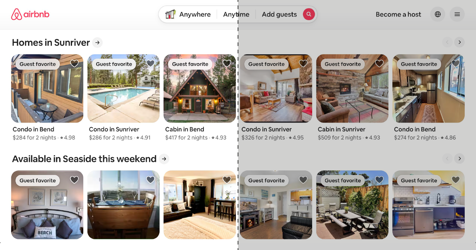
Modern brand example: Airbnb’s use of symmetry and order gives its desktop interface a clear sense of structure and rhythm. Mirrored elements create balance, while the UI’s spacing and alignment make navigation feel obvious, even when there’s a lot on the screen. This helps visitors quickly find what they need.
Design takeaway: Clear structure and visual order make layouts easier to digest.
Common mistake: While symmetry supports clarity, leaning on it too much can make a layout feel rigid. Introducing just enough variation helps keep things interesting without losing clarity.
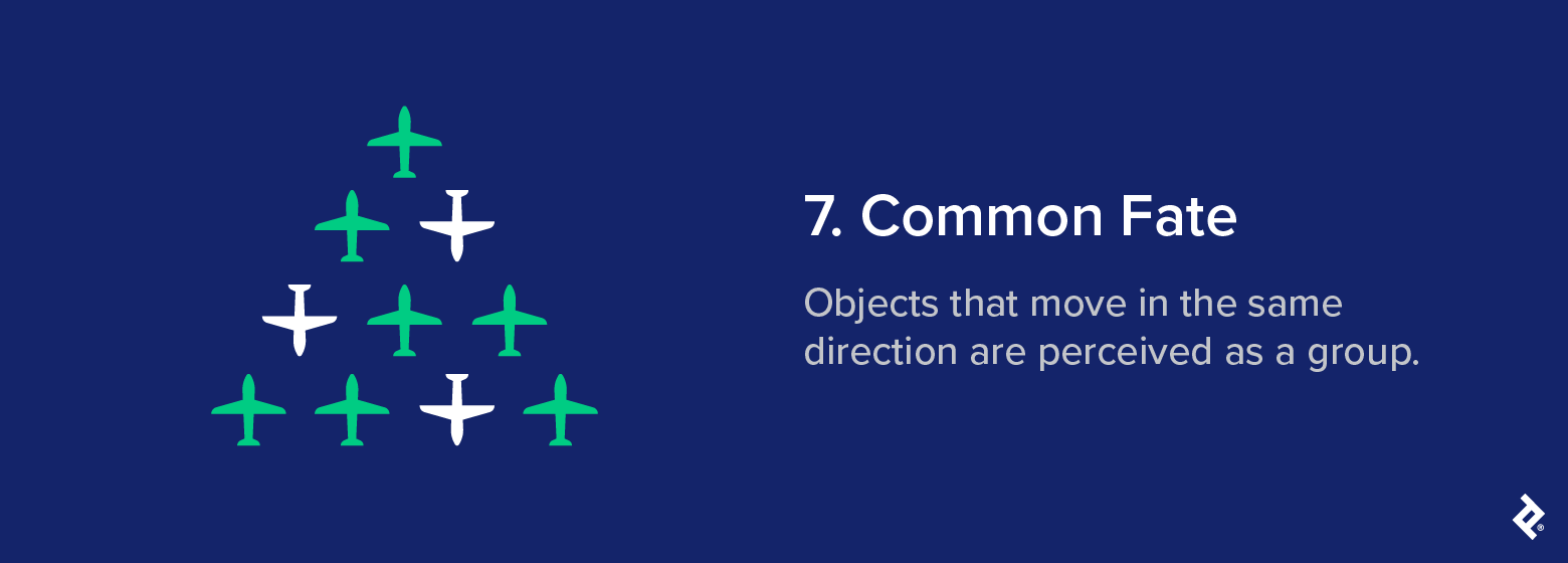
7. Common Fate
No, we’re not talking about star-crossed lovers. Common fate is a Gestalt grouping principle that describes how we associate things that point to or are moving in the same direction.
Definition: Objects that move in the same direction are perceived as a group.
Psychological basis: The brain links movement with meaning. When elements move together, we interpret them as part of the same system or purpose.
Classic example: In nature, we see common fate at play in things like flocks of birds or schools of fish. Because they move seemingly as one, our brains perceive them collectively and interpret them as a single entity.
UX/UI application: In UX, directional animations can show that elements are connected. For example, when a set of icons shifts together to reveal more options, or when grouped cards slide in the same direction (i.e., they share a common fate), users view them as part of the same action or context.
Modern brand example: Apple makes clever use of the common fate principle in iOS when you long-press a home screen icon to rearrange or delete it. All the icons on the home screen start jiggling in sync, acting as a visual cue that they’re now in the same editable, movable state.
Design takeaway: Shared motion creates unity and guides attention.
Common mistake: Unrelated interface elements that move together can confuse users and draw attention away from more important cues.
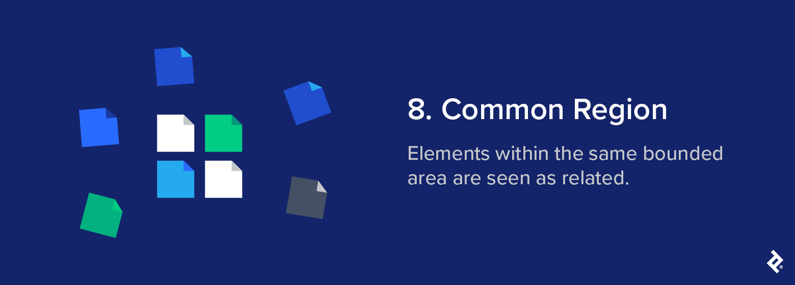
8. Common Region
The Gestalt principle of common region explains how the brain groups elements that share a defined boundary, even if they don’t share other visual similarities.
Definition: Elements within the same bounded area are seen as related.
Psychological basis: We instinctively associate things that share the same space. When elements are enclosed within the same box or container, we view them as being related, even if they differ in appearance.
Classic example: Color is the only difference in the document icons below, but the eye sees the orderly quadrant of icons as a separate group from the outer icons, which frame the composition.
UX/UI application: The Gestalt principle of common region is one of the clearest ways designers can create structure without relying on alignment or proximity alone. Instead, the boundary is what signals to the viewer that the elements inside belong in a group. In UI design, this is the basis of card-based layouts, dashboard panels, and sectioned content blocks. When information sits within the same container, users immediately understand that it shares a common purpose.
Modern brand example: Netflix applies the principle of common region across its homepage layout. Each content row, such as Continue Watching or We Think You’ll Love These, acts as a visual container that groups related tiles together. These make it easier for users to scan and quickly understand the context of what they’re seeing, because their placement within a shared frame signals that they belong to the same set.
Design takeaway: Boundaries define belonging. They’re usually most effective when you need to create clear structure quickly, especially in dense or information-heavy layouts.
Common mistake: Overusing boxed regions or visual enclosures can clutter an interface and muddle the visual hierarchy, making for a frustrating user experience.
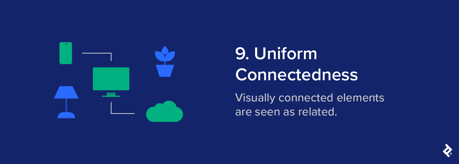
9. Uniform Connectedness
Uniform connectedness describes the brain’s tendency to group objects that share a visual link. It’s considered one of the strongest Gestalt grouping principles, often overriding other cues like proximity and similarity.
Definition: Visually connected elements are seen as related.
Psychological basis: Our brains instinctively form relationships between elements that are visibly connected. This connection can take many forms, but once it’s there, our brain perceives them as belonging together.
Classic example: The smartphone, television, and cloud, aided by color and an implied line, are seen as a system, even though the television could just as easily be related to the blue household items.
UX/UI application: In UI design, uniform connectedness helps communicate structure and flow. It’s frequently used in timelines, progress trackers, and other interfaces that involve guiding users through multiple steps.
Modern brand example: In the DoorDash app, users track their order through a row of icons representing each step in the fulfillment process. A horizontal progress bar connects the icons and fills from left to right as the order travels from the kitchen to the user’s doorstep. Because the icons are joined by a single line, we see them as part of the same process.
Design takeaway: Visual connections clarify relationships and help users follow the logical path through an interface. Used with care, they help maintain flow without needing additional labels or structural framing.
Common mistake: Unnecessary lines or connectors add visual noise and can confuse users if they imply relationships that don’t exist.
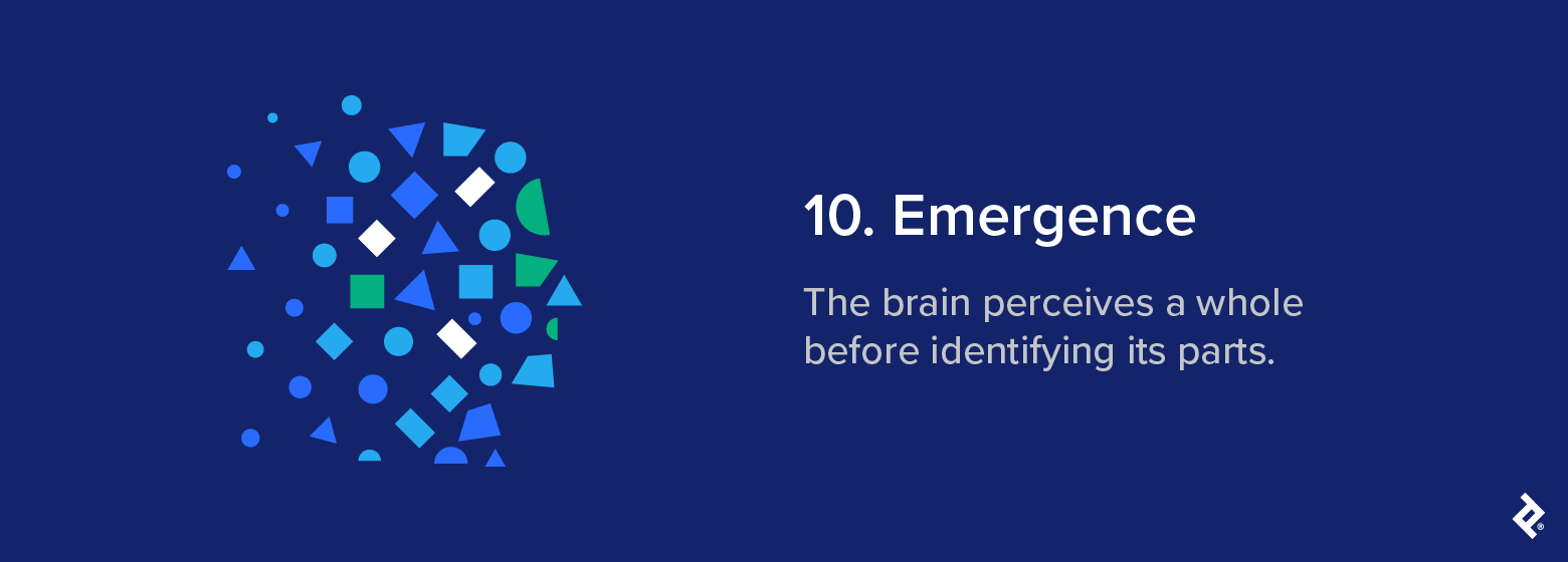
10. Emergence
Imagine looking at a traffic jam from a distance. At first, you just see a sea of color and movement. But as you focus, you begin to take note of the individual vehicles that make up the mass, each with its own shape and color. This is the Gestalt principle of emergence.
Definition: The brain perceives a whole before identifying its parts.
Psychological basis: We tend to recognize the overall form of something before picking out the finer details. This happens instantly, allowing us to make sense of a scene without conscious effort.
Classic example: Although the image is just a collection of blue, white, and green shapes on a dark blue background, most viewers will quickly spot the form of a human face. The brain considers the overall form before registering the individual parts.
UX/UI application: Designers can use emergence to shape how users perceive structure and hierarchy at a glance. A strong visual structure helps users quickly absorb the overall layout before processing the finer details. This is especially important in dashboards and similar visualization tools.
Modern brand example: While not a direct example of emergence, platforms like Google Analytics and Tableau use similar perceptual cues. A quick glance helps users grasp overall trends instantly before drilling into more specific data points.
Design takeaway: Design for instant comprehension. Structure layouts so the overall meaning is clear from the get-go.
Common mistake: Overly complex visuals can delay recognition and force users to work harder to see patterns.
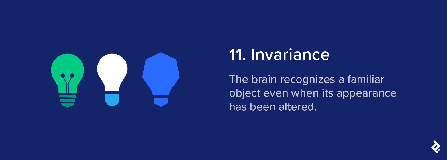
11. Invariance
You don’t need to see the Nike swoosh the right way up to recognize it immediately. Stretch it, distort it, or view it upside down, and you still know exactly what you’re looking at. This is the Gestalt principle of invariance.
Definition: The brain recognizes a familiar object even when its appearance has been altered.
Psychological basis: Our brain recognizes patterns by their structure, rather than by surface-level details. Once we’re familiar with an object, we can identify it even when its size, angle, or appearance changes.
Classic example: We can identify familiar shapes, like a lightbulb, regardless of heavy abstraction. Whether stretched, shrunk, warped, distorted, or shown in different lighting, we still know exactly what these shapes are because our brain recognizes their underlying structure.
UX/UI application: In UI design, invariance helps users stay oriented when styles or layouts change. Recognizable icons, symbols, and spatial relationships help maintain consistency across different layouts and platforms.
Modern brand example: The iconic Adidas stripes appear in several configurations: slanted on shoes, stacked into a mountain shape on performance wear, arranged horizontally on classic gear, or as negative space cutting through its Trefoil logo. Even with these variations, the brand remains immediately identifiable because the core structure is enough for the brain to recognize.

Design takeaway: Aim for variation that supports recognition, rather than obscuring it. Invariance works best when it provides breathing room for style adaptations while keeping the core elements clear and familiar.
Common mistake: Recognition tends to hold as long as the visual foundation stays intact; if this wanders too far from what the brain expects, the sense of familiarity begins to break down.
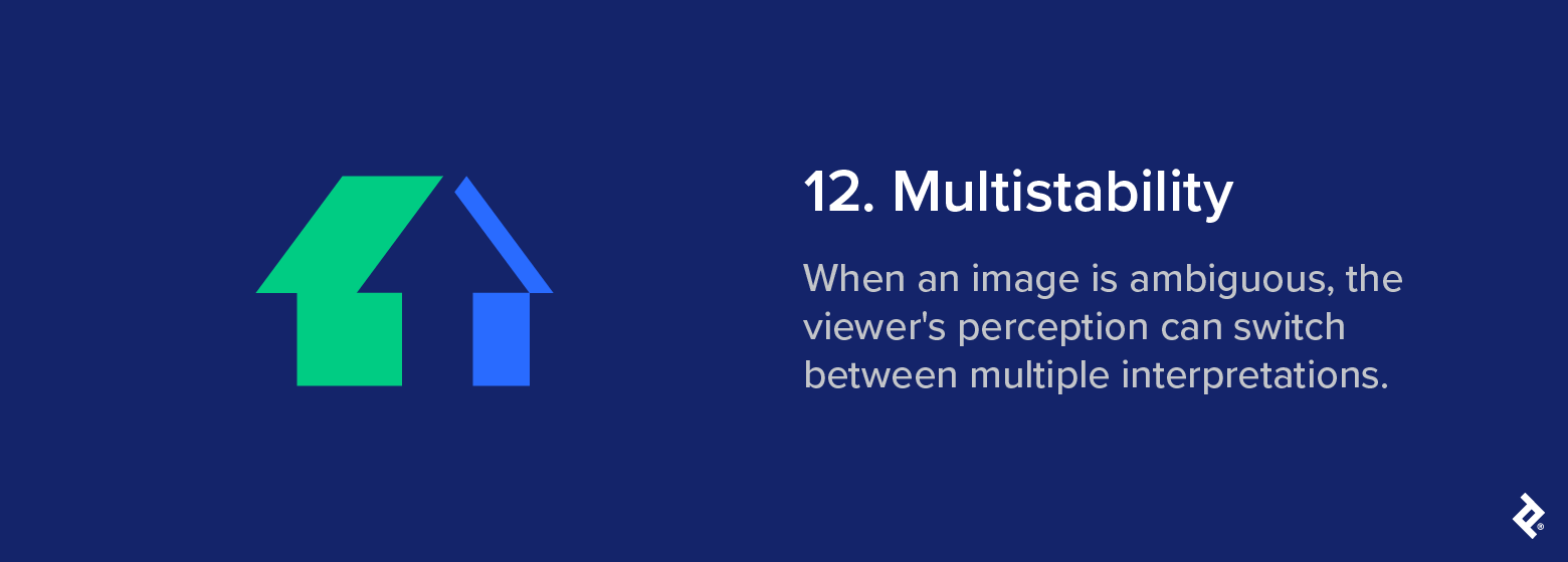
12. Multistability
Some images mess with your head … and that’s the point. You see one thing one minute and another the next, not because the image changes, but because your brain does. This is the Gestalt principle of multistability.
Definition: When an image is ambiguous, the viewer’s perception can switch between multiple interpretations.
Psychological basis: The brain seeks order when faced with uncertainty. When an image can be read in more than one way, our perception alternates between them as our brain tries to land on a stable interpretation.
Classic example: Take this classic house/arrow illusion. At first glance, your eye might see a house as you scan from the left point of the roof inward. But when you reach the center, your eye adjusts and an upward facing arrow emerges. You can’t see both interpretations at once, but each is equally valid and “real.”
UX/UI application: Designers sometimes use this Gestalt law to invite a different kind of engagement, possibly by hiding one image inside another or creating a graphic that changes form based on context or orientation. Done well, multistability slows the viewer down just enough to make them look twice and take note of what they’ve seen.
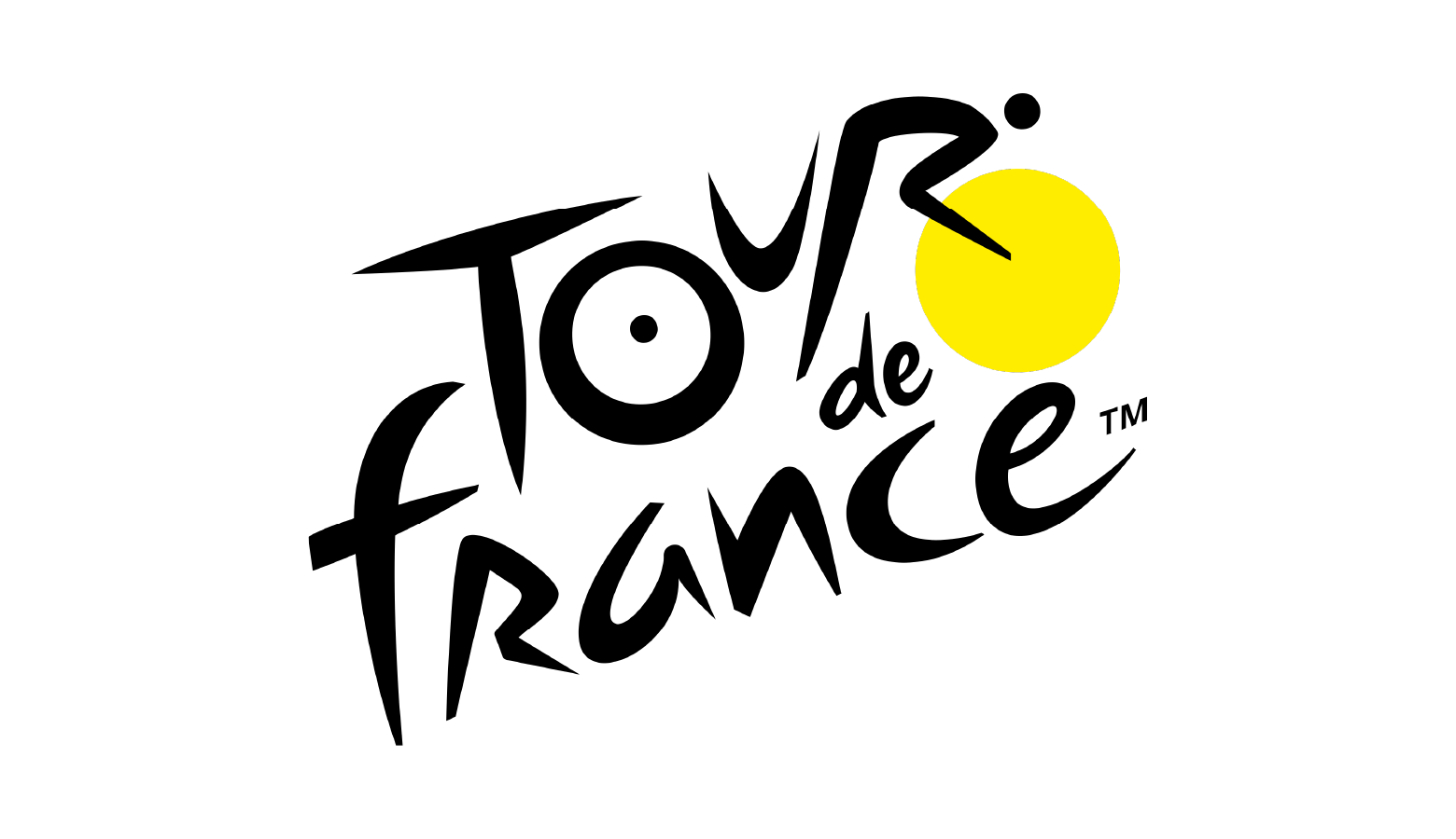
Modern brand example: The Tour de France logo is an intriguing example of multistability. What looks like a dynamic logotype also contains the body of a cyclist. The ‘O’ and the yellow circle represent the bicycle’s wheels, the ‘U’ is the frame, and the ‘R’ is the rider’s body leaning into a hill.
Design takeaway: Multistability can encourage deeper engagement by creating memorability and intrigue.
Common mistake: Ambiguity is rarely the goal in product design. If visual elements read in conflicting ways, or if users aren’t sure what they should be doing or looking at, they’ll be left confused. The balance between curiosity and clarity is what makes the Gestalt law of multistability useful in the right setting and disruptive in the wrong one.
Download Gestalt Principles of Design PDF
Gestalt in UX Practice
How Gestalt Principles Work Together
Designing an interface that feels accessible and intuitive depends on how Gestalt laws are applied together.
A web interface might use consistent iconography to give repeated elements a sense of identity (similarity), while clear spatial groupings help clarify what belongs together and what doesn’t (proximity). When visual cues support each other, users rarely need to pause and figure out what they’re seeing. Instead, alignment and flow naturally guide their gaze from one point to the next.
Why Visual Hierarchy Matters
Visual hierarchy is particularly important in dashboard environments, where multiple visual elements are often competing for attention. Interfaces built around isolated or inconsistently styled elements demand more from the user because they lack visual logic that the brain can latch on to. As a result, key data points may be missed and users may be left uncertain of what actions to take.
In situations like these, even basic design corrections can be enough to restore coherence. This may be as simple as tightening spacing between related components, or applying visual cues like similarity or common region to establish relationships between elements.
Conscious use of Gestalt principles shapes how users scan, interpret, and act on information. Studies using eye-tracking have consistently shown that interfaces designed with clear visual hierarchy and perceptual organization lead to faster visual search times and lower error rates. When structure is easier to process, the eye intuitively knows where to land and decisions follow more naturally.
Gestalt Theories: Application Beyond Design
Gestalt thinking applies to pretty much any situation where perception is used to navigate complexity. After all, our visual system doesn’t switch off the moment we look away from the screen.
The Value of Perceptual Shortcuts
Every field that deals with human attention depends on predictable perceptual habits. This is why product designers format packaging and interface elements in ways that feel purposeful and easy to scan.
Even architecture draws on Gestalt logic: Entry points, framing, transitions, and spatial rhythm all play a role in guiding attention and making movement through a space feel natural.
What binds these design choices is the shared aim of reducing cognitive drag and building visual logic into the structure itself. When layouts follow clear visual cues, the brain requires less effort to make sense of what’s in front of it because it already feels ordered and familiar.
How Gestalt Helps Attention Flow
The value of these cues lies in how quickly they communicate priority, relevance, or intent.
- An entryway can set expectations the moment someone crosses a threshold.
- A storefront can signal purpose without relying on explicit signage.
- A product label can convey meaning simply through how it’s placed in relation to others.
This way, attention flows in a steady arc from what matters most to what comes next, without being forced or distracted. That makes Gestalt thinking a functional toolkit for anyone shaping messaging, systems, or environments where attention has to be earned in just a few short seconds.
Common Gestalt Pitfalls and Misinterpretations
Applying Gestalt principles effectively calls for a light touch, and strong design means knowing where to hold back as much as it does knowing where to assert visual hierarchy. Common pitfalls include:
- Competing visual cues: Gestalt principles break down when too many visual cues pull in different directions. If color suggests one grouping, spacing another, and alignment something else entirely, this can create friction, and friction is fluency’s worst enemy.
- Oversymmetry: Symmetry creates its own risks when applied too mechanically. Over-polished layouts can start to feel inert: balanced, but flat. While tidy UI design is good practice, Gestalt principles of organization are about guiding perception in a way that feels immediate, rather than adhering to neatness for its own sake. When you design a UI where every visual element holds the same weight, the eye has nothing to latch onto.
- Too much movement: Animation can be useful when it introduces rhythm or clarifies the flow of logic, but when it becomes decoration, it usually ends up competing with the content. Instead of helping users orient themselves, it splits their attention and drains their cognitive bandwidth.
Gestalt Is a Powerful Design Framework
This guide has covered 12 of the core Gestalt principles of perception, and has hopefully left you with a clearer understanding of how they shape modern UI and UX design. While Gestalt psychology doesn’t explain every aspect of visual behavior, working knowledge of these principles makes it easier to create systems that feel intuitive at first glance.
It’s worth reiterating here that Gestalt isn’t a style guide per se. Rather, it’s a science-based, empirically grounded psychological model of how the brain interprets structure. This makes it less of a visual philosophy and more of a framework for ensuring your designs reflect the way people already process visual information.
Whether you’re designing a checkout flow, creating a dashboard, or structuring messaging to make it easier to absorb, the same concept applies: Perception drives understanding. Layouts either align with these instinctive perceptual habits or create friction by ignoring them.
So use Gestalt thinking thoughtfully. Let it support clarity and momentum. And when in doubt, rely on what the brain already wants to do: get from point A to point B with as little effort as possible.